

Appearance
Theme configuration
For merchants
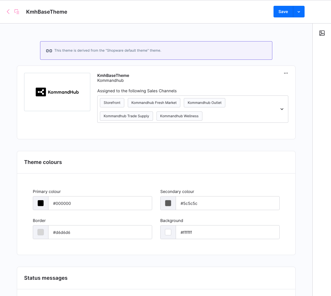
Where: Content → Themes → KmhBaseThemeStored as: Shopware theme configuration (one set of values per theme) Applies to: every sales channel the theme is assigned to
All settings are on one page, grouped in seven cards: Colours, Status colours, Typography, Commerce, Media, Layout and Components. Click Save at the top right; Shopware recompiles the theme for the assigned sales channels, which can take a minute. Reload the storefront to see the change.
Most settings are applied when the theme is compiled, not on every page view. If a change does not show, see Troubleshooting → A setting has no effect.
One theme, several storefronts
Theme settings belong to the theme, not to the sales channel. To give two storefronts different settings, duplicate the theme under Content → Themes and assign the copy to the second storefront.
Colours
| Setting | Type | Default | Description |
|---|---|---|---|
| Primary (black) | Colour | #000000 | Standard Shopware field. Little or no visible effect — see the note below. |
| Secondary | Colour | #5c5c5c | Standard Shopware field. Little or no visible effect. |
| Border | Colour | #d6d6d6 | Standard Shopware field. Little or no visible effect. |
| Background | Colour | #ffffff | Standard Shopware field. Little or no visible effect. |
The standard colour fields are fixed by the design system
The theme's palette — black, white and a fixed grey scale — is built into its stylesheet and takes priority over Shopware's standard colour fields. The fields Primary, Secondary, Border, Background (this card), Text, Headline (Typography) and Price, Buy button, Buy button text (Commerce) are kept so the theme manager looks familiar, and their defaults match the palette, but changing them does not recolour buttons, text, borders or the page background. To use a brand colour, a developer can customise the palette in a child theme.
Status colours
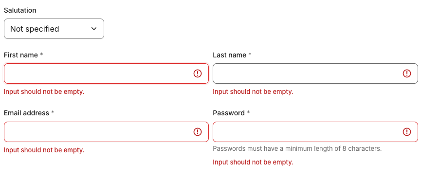
The only colours in the interface besides the rating stars. They drive alerts, form errors, badges and order-status chips. From each colour the theme derives a light tint for backgrounds, a border shade and a darker text shade that stays readable (WCAG AA).
| Setting | Type | Default | Used for |
|---|---|---|---|
| Success tone | Colour | #16a34a | Success messages, "added to cart", completed orders |
| Info tone | Colour | #2563eb | Info messages, open and in-progress orders |
| Warning tone | Colour | #d97706 | Warnings |
| Danger tone | Colour | #dc2626 | Errors, invalid form fields, cancelled and failed orders, the saved wishlist heart, reduced prices |
In dark mode the theme uses its own brighter versions of these four colours so text stays readable on the dark background; your values apply to light mode.
Typography
| Setting | Type | Default | Description |
|---|---|---|---|
| Base font | Font family | 'Inter', -apple-system, BlinkMacSystemFont, 'Segoe UI', Roboto, Helvetica, Arial, sans-serif | Body text, labels, buttons. Inter is self-hosted by Shopware; the rest is the system fallback. |
| Text | Colour | #1a1a1a | Standard Shopware field. Little or no visible effect — see Colours. |
| Headline font | Font family | Same as Base font | Headings. |
| Headline | Colour | #1a1a1a | Standard Shopware field. Little or no visible effect. |
A font family is a list: the browser uses the first font in it that it has. Naming a font here does not load it — a font that is neither Inter nor installed on the visitor's device is skipped. To use another web font, a developer must add it first — see Customising → Fonts.
Commerce
| Setting | Type | Default | Description |
|---|---|---|---|
| Price | Colour | #1a1a1a | Standard Shopware field. Little or no visible effect — prices use the text colour; reduced prices use the danger tone. |
| Buy button | Colour | #000000 | Standard Shopware field. Little or no visible effect — the buy button follows the primary-button style. |
| Buy button text | Colour | #ffffff | Standard Shopware field. Little or no visible effect. |
| Rating stars | Colour | #d97706 | Filled review stars and the rating-distribution bars on product pages. Help text: keep at least 3:1 contrast against white and against the dark-mode surface. |
Media
| Setting | Type | Default | Description |
|---|---|---|---|
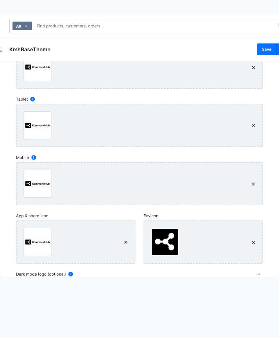
| Desktop logo | Media | Kommandhub logo | Header logo from desktop width, and the logo in the footer. |
| Tablet logo | Media | Kommandhub logo | Header logo on tablets. Used only if it differs from the desktop logo. |
| Mobile logo | Media | Kommandhub logo | Header logo on phones. Used only if it differs from the desktop logo. |
| Share logo | Media | Kommandhub logo | Image used when a page is shared on social networks. |
| Favicon | Media | Kommandhub icon | Browser-tab icon. |
| Dark mode logo (optional) | Media | Empty | Header and footer logo while dark mode is on, for all screen sizes. Leave empty to show the desktop logo colour-inverted — fine for a single-colour logo, wrong for a coloured one. Only used when Dark mode toggle is on. See Dark mode → Logo. |
Replace the default logos
The theme ships with the Kommandhub logo and icon as placeholders. Upload your own logo and favicon before going live.
Layout
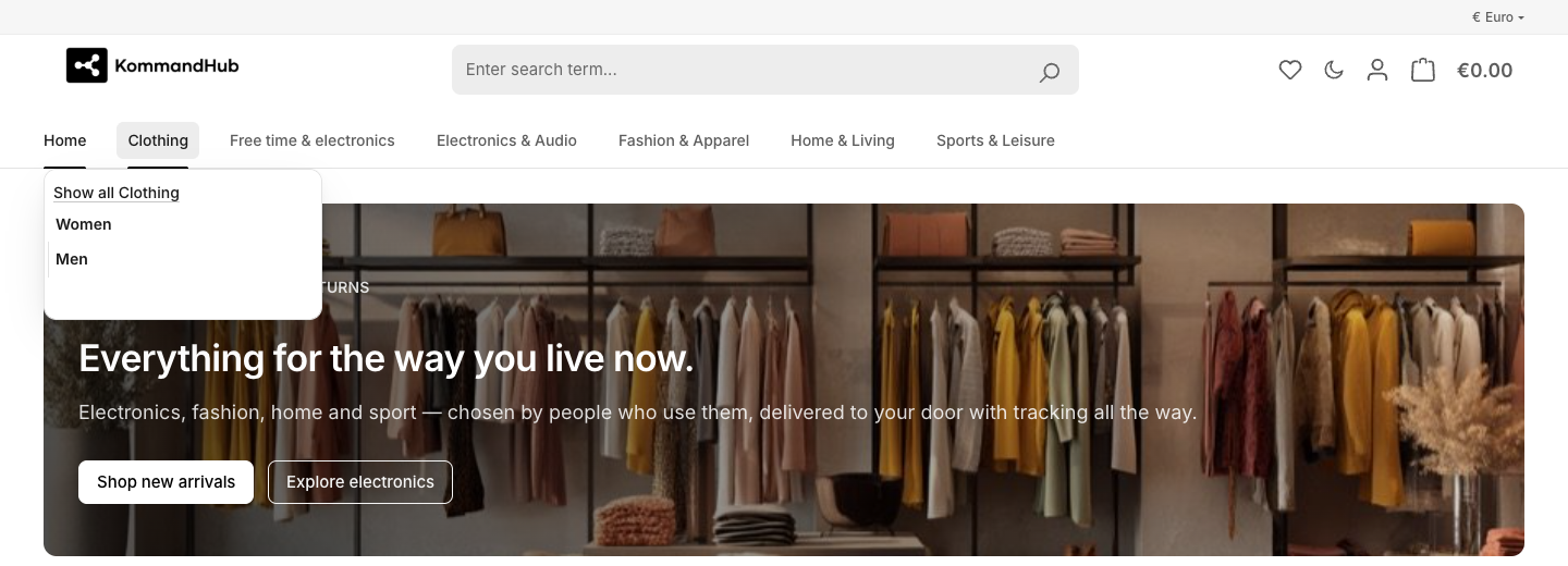
| Setting | Type | Default | Options / range | Description |
|---|---|---|---|---|
| Container width | Single select | Fixed (container) | Fixed (container) · Full width (fluid) | Fixed centres the page content at Content max-width. Full width lets it run edge to edge, keeping the side gutters. |
| Content max-width (px) | Number | 1400 | Pixels | Maximum width of the page content when Container width is Fixed. |
| Section spacing | Single select | Normal | Compact · Normal · Spacious | Space above and below each Shopping Experiences section: 28 px, 40 px or 60 px. |
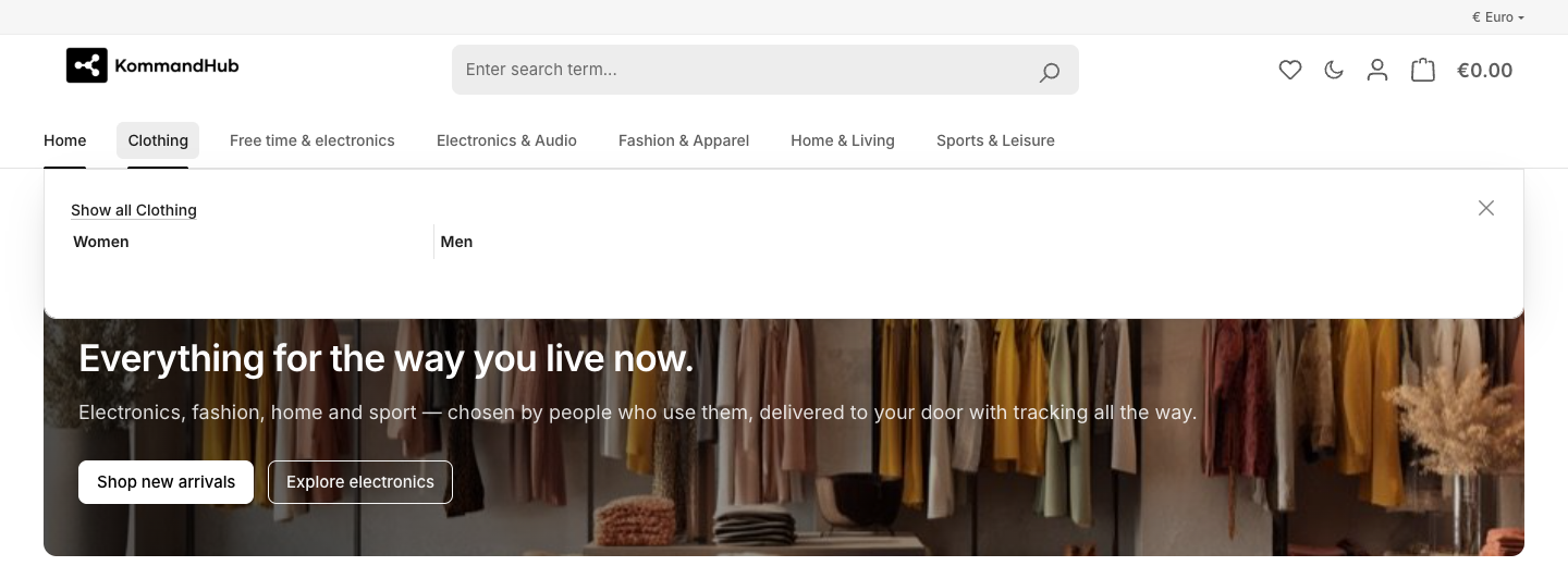
| Sticky header | Checkbox | On | Header and main navigation stay at the top of the screen while scrolling, on a slightly translucent background. | |
| Show top bar | Checkbox | Off | Shows the thin bar above the header on desktop. The bar is always shown when the storefront offers more than one language or currency, because the switchers live there — this setting cannot hide it then. See Storefront → Top bar. | |
| Show breadcrumb | Checkbox | On | The "Home / Category / Product" trail above the page title. Off removes it completely. | |
| Navigation style | Single select | Mega flyout | Mega flyout · Dropdown | How a main-navigation category opens on desktop: a full-width panel with all sub-categories (and the category teaser image), or a compact single-column list without image. |
| Footer columns | Number | 4 | Whole number, 1 or more | How many footer columns share one row from tablet width. Phones always show one collapsible column per section. |
Components
| Setting | Type | Default | Options / range | Description |
|---|---|---|---|---|
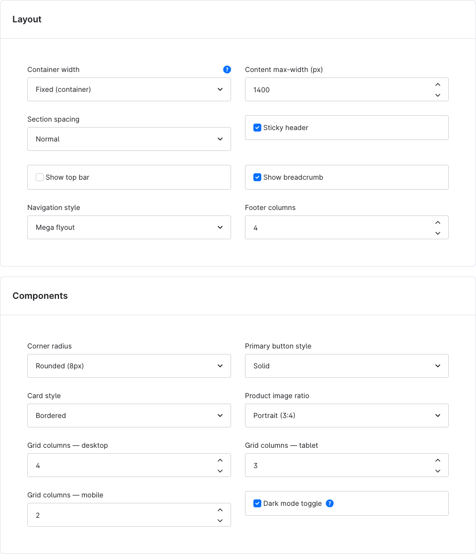
| Corner radius | Single select | Rounded (8px) | Sharp (0) · Subtle (6px) · Rounded (8px) · Pill | Corner rounding of buttons and inputs. Cards, dropdowns and dialogs are rounded a step more (up to 16 px for cards and 20 px for dialogs); Pill makes buttons and inputs fully round but keeps cards at 16 px. |
| Primary button style | Single select | Solid | Solid · Outline | Solid: black buttons with white text (white with black text in dark mode). Outline: transparent buttons with a border that fill on hover. Applies to primary buttons and the buy button. |
| Card style | Single select | Bordered | Bordered · Elevated · Flat | Look of product cards in listings and product sliders. Bordered: hairline border. Elevated: no border, soft shadow, lifts on hover. Flat: no border, light grey background on hover. |
| Product image ratio | Single select | Portrait (3:4) | Square (1:1) · Portrait (3:4) · Landscape (4:3) | Shape of the image area on product cards. Images fill the area and are cropped to fit. |
| Grid columns — desktop | Number | 4 | Whole number, 1–6 | Products per row in category and search listings from 1200 px wide. |
| Grid columns — tablet | Number | 3 | Whole number, 1–6 | Products per row from 768 px wide. |
| Grid columns — mobile | Number | 2 | Whole number, 1–6 | Products per row below 768 px. |
| Dark mode toggle | Checkbox | On | Adds the moon button next to the account and cart icons. The visitor's choice is stored in their browser. Off removes the button and all dark-mode scripts. See Dark mode. |
The grid columns apply to product listings only; product sliders in Shopping Experiences keep their own layout.
Use whole numbers from 1
The number fields are not validated. The theme divides the row width by the value, so 0, negative numbers or decimals give a broken grid or footer. Use whole numbers from 1 (1–6 for the grid).
Settings elsewhere
| What | Where |
|---|---|
| Which theme a storefront uses | Sales Channels → (storefront) → Theme |
| Languages and currencies shown in the top bar | Sales Channels → (storefront) → General |
| Footer columns' content | Sales Channels → (storefront) → General → Footer navigation, and its categories under Content → Categories |
| Shopping Experiences layouts | Content → Shopping Experiences — see Shopping Experiences |
| Shop name used as the footer logo's alternative text | Settings → Basic information |