

Appearance
Dark mode
For merchants
Visitors can switch your storefront to a dark colour scheme with one click. Every page follows: header, listings, product pages, cart, checkout, account, modals and Shopping Experiences.
How visitors use it
A moon button sits next to the account and cart icons in the header, on desktop, tablet and phone. Clicking it switches between light and dark.

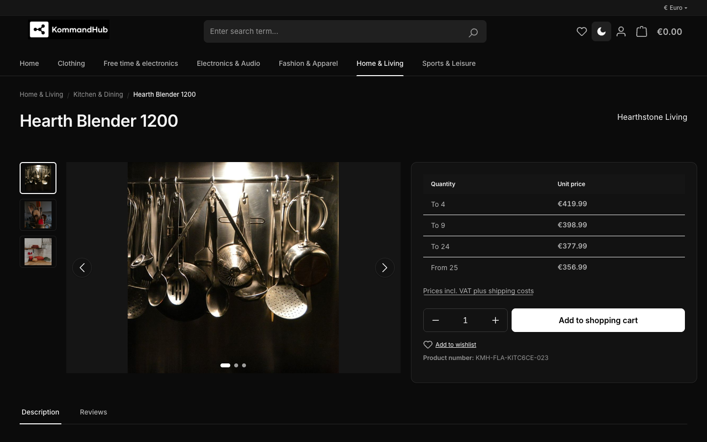
- The choice is remembered in the visitor's browser and applied on every page and on later visits — before the page appears, so it never flashes light first.
- Every visitor starts in light mode. The theme does not follow the device's dark-mode setting; the visitor has to click the button once.
- The choice is per browser and device. It is not saved in the customer account and is not sent to your shop.
- Screen readers announce the button as Toggle dark mode (German: Dunkelmodus umschalten) and whether it is pressed.
Turn it on or off
Content → Themes → KmhBaseTheme → Components → Dark mode toggle (on by default), then Save.
With the setting off, the button and both small dark-mode scripts are removed from the storefront, and every visitor sees light mode — including those who had chosen dark before.
Logo
A dark header needs a logo that is visible on a dark background.
- Without a dark-mode logo (default), the theme shows your desktop logo colour-inverted: black becomes white. This works for a single-colour logo. A coloured logo comes out in the wrong colours.
- With a dark-mode logo, upload a light version of your logo to Media → Dark mode logo (optional). It replaces the header logo on all screen sizes and the footer logo while dark mode is on.
The dark-mode logo is only used while Dark mode toggle is on.

Colours in dark mode
Dark mode is a fixed, tested palette: near-black backgrounds, surfaces that get lighter the higher they float (cards, dropdowns, dialogs), and low-contrast hairline borders. Status colours are brightened so text keeps WCAG AA contrast.
- Your Status colours settings apply to light mode. Dark mode uses the theme's own brighter success, info, warning and danger shades.
- The Rating stars colour applies in both modes — choose one with at least 3:1 contrast against white and against the dark surface. The default amber does.
What dark mode does not change
- Emails, PDF documents and the Administration.
- Images and Shopping Experiences background images or colours you set in a layout — check pages with white product photos or light CMS backgrounds in dark mode.
- Third-party plugins that hard-code their own colours. Kommandhub's Click and Pick, Paystack, Flutterwave and SMS plugins are covered — see Storefront → Kommandhub plugins.
If something stays white or turns dark-on-dark, see Troubleshooting → Something looks wrong in dark mode.