

Appearance
What changes in the storefront
For merchants
Base Theme keeps Shopware's storefront structure and features — the same pages, menus and checkout steps — and changes how they look and, in a few places, how they are marked up for accessibility. This page lists what your customers notice.
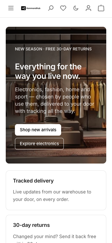
Header
- Sticky — the header row and the main navigation stay at the top of the screen as one unit while scrolling, on a slightly translucent, blurred background. Switch off with Layout → Sticky header.
- Action icons — search, wishlist, account, cart and the dark-mode button share one size and line, and their counters (cart, wishlist) are fully visible.
- Phones — menu, logo, search, account and cart fit on one row.
- Search suggestions open directly under the search field.
Top bar
The thin bar above the header, desktop only (from 992 px wide). It spans the full screen width and holds Shopware's language and currency switchers; their menus open above the header.
| Languages or currencies in the sales channel | Show top bar off (default) | Show top bar on |
|---|---|---|
| Only one of each | Hidden | Shown, empty unless another plugin adds content |
| More than one | Shown with the switchers | Shown with the switchers |
Main navigation
- Links are grey at rest and turn black on hover with a light pill behind them. The section the visitor is in — and the one whose menu is open — gets a 2 px black line underneath.
- Navigation style decides how a category opens on desktop: a full-width mega flyout with all sub-categories and the category image, or a compact dropdown list. See Theme configuration → Layout.
- The account menu opens as a single dropdown card; the off-canvas menu on phones uses the same rounded-row style as the account and category navigation.
Breadcrumb and page titles
Every listing, product, account and checkout page uses one pattern: a small grey breadcrumb, then the page title, an optional description, then the content.
- Separators are
/. Earlier steps are links; the current page is plain text, marked for screen readers as the current page. - On a product page all categories are links and the product name is the last step. (Shopware's default marks the category as the current page.)
- On a top-level category the one-step trail would only repeat the title, so it is hidden.
- On phones the trail is shortened to
… / parent / currenton a single line. - Search engines still receive the structured breadcrumb data.
Switch the breadcrumb off with Layout → Show breadcrumb.

Category and search listings
- Filters in a horizontal row of even-height buttons above the products; boolean filters show a ring when active, and active filters appear as chips. On phones the filter panel stacks full width.
- Sidebar category navigation highlights the current category.
- Product cards in a row have equal heights. Number per row, image shape and card style come from the Components settings.
- The wishlist heart turns red once a product is saved.
- The current page in the pagination is solid black.
Product page
- Gallery, buy box and price in a calm layout; slider arrows are round 40 px buttons that are never cut off.
- Description tab: text set at a comfortable reading width; product properties as a clean list with hairline dividers.
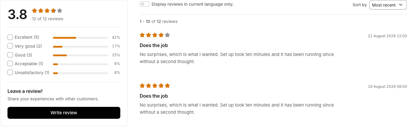
- Reviews tab: the average score as a large number next to the stars, aligned rating-distribution bars, the review date beside the stars and shop replies in their own panel. Stars and bars use the Rating stars colour.
- Cross-selling sliders keep equal card heights and room for the hover lift.
Cart, checkout and account
- Cart: off-canvas cart drawer and cart page on the design system, with a green-tinted confirmation when a product is added.
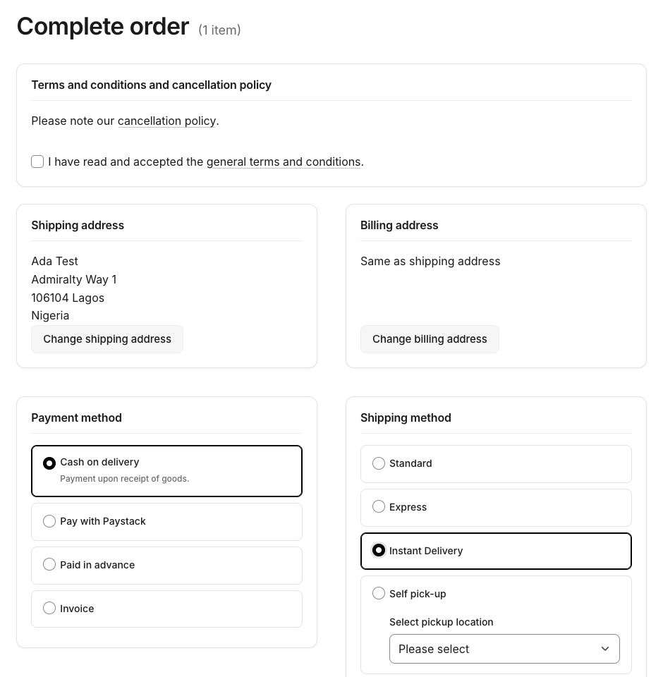
- Checkout: confirm and finish pages; selected payment and shipping methods and addresses get a black ring plus their own radio or check mark — colour is never the only signal.
- Forms (register, address, checkout): 40 px fields with 16 px text (so phones do not zoom in), a black border and soft halo on focus, and a red border plus message when a field is invalid.
- Order history: order status chips are coloured by meaning — open and in progress in the info colour, completed in the success colour, cancelled and failed in the danger colour.
- Address manager (Shopware 6.7): rounded address cards, a neutral default chip, and the checkout address modal with a segmented shipping/billing switch.
Footer
- Your desktop logo (or dark-mode logo) above the service hotline, linking to the home page. It stays visible when the footer columns collapse on phones.
- The number of columns per row comes from Layout → Footer columns.
- Payment-method logos are shown in greyscale and regain their colour on hover.
Messages, dialogs and menus
Alerts, badges, modals, dropdowns, tooltips and off-canvas panels use the same surfaces, shadows and corner radius. Alerts and badges combine a tint, a border, readable text and Shopware's per-type icon.
Accessibility
- Text contrast meets WCAG AA (4.5:1, 3:1 for large text) in light and dark mode; form borders meet 3:1.
- A solid 2 px focus ring appears on every control when using the keyboard, and is never hidden.
- Links inside running text keep a thin underline, because they share the text colour.
- Animations are reduced for visitors who ask their device for reduced motion.
Kommandhub plugins
When these Kommandhub plugins are installed, the theme restyles their storefront parts to match. Nothing is needed from you, and the theme works without them.
| Plugin | What the theme adjusts |
|---|---|
| Click and Pick | Pickup labels and selects in checkout; the pickup card on the finish page in theme colours, light and dark |
| Paystack / Flutterwave | Bank details as label/value pairs in the account; with both active, the two cards sit side by side |
| SMS | The dial-code + number phone field keeps its rounded corners |
Any plugin that uses a plain select box gets the same chevron as Shopware's own selects.
For Shopping Experiences layouts see Shopping Experiences.